Thoughtful insights from two Dribbble workshops, “Designing Beautiful Interfaces” and “Designing for Accessibility”.
2minutes remaining
I recently had the pleasure of attending two workshops put on by Dribbble.com. Both workshops, “Designing Beautiful Interfaces” and “Designing for Accessibility” were hosted by Matt D. Smith (also known as MDS). Matt is the owner and Design Director of a small independent design studio in Athens, GA. He has created a few well-known applications in the field; Flowkit, which helps create workflows within design tools, Contrast, which enables users to check WCAG color contrast ratios on their computer, and Float Label Pattern, for digital input fields. Having so much knowledge in the field, I was happy to spend six hours learning all that I could from his workshops.
Designing beautiful interfaces and making them accessible does not have to be an either/or scenario. It is 100% possible to make an accessible website that functions well for compliance and is also aesthetically pleasing. There are many areas to consider when creating a smooth, fluid, well-designed website that is also compliant with Web Content Accessibility Guidelines (WCAG). Here are some of the best tips and strategies from MDS’s workshops.
Tips for designing beautiful interfaces
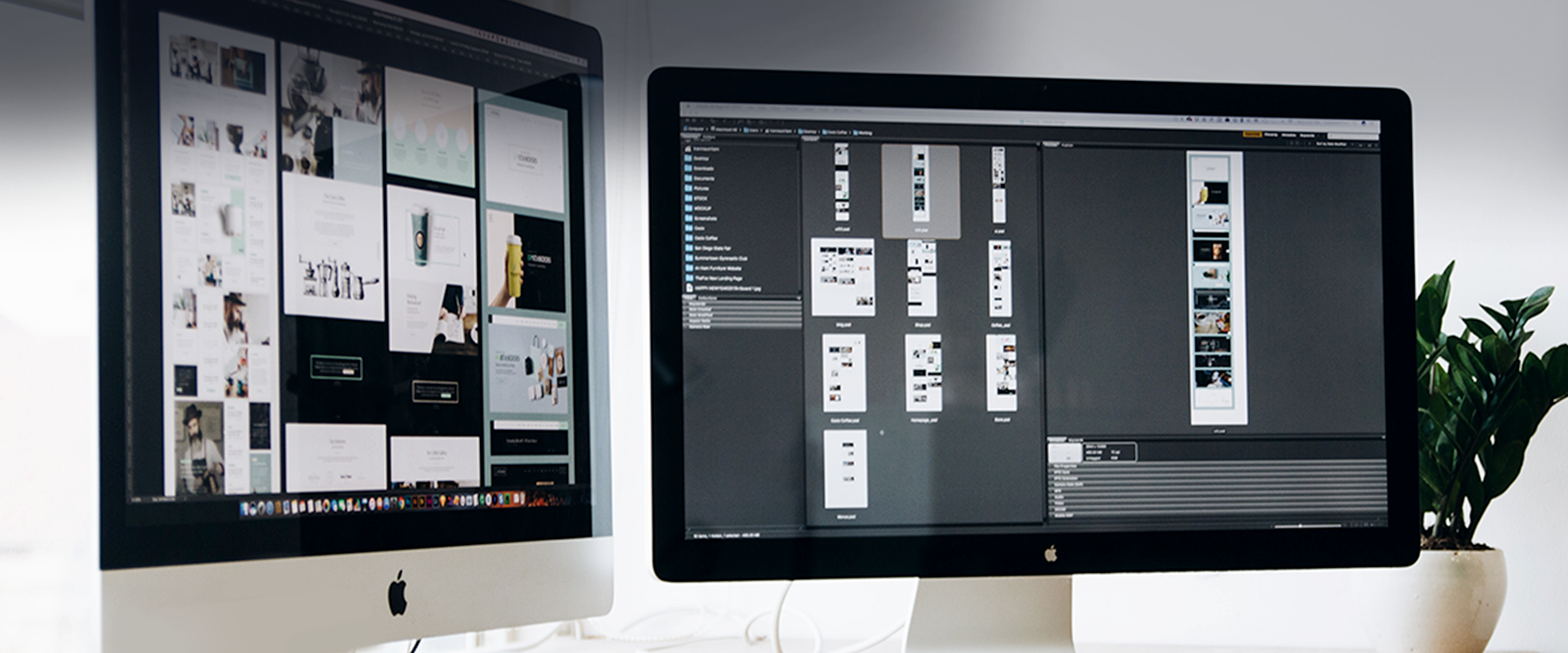
When designing interfaces, whether for a website or a mobile app, there are both rudimentary and complex ideas to consider. Many of these ideas come from understanding basic design principles like grids, alignment, contrast, color, etc. Others are focused on the overall strategy for the site such as identifying key stakeholders and how to interact with developers.
Our “Designing Beautiful Interfaces Checklist” provides direction on double-checking work to make sure everything has been thoroughly thought-out. It takes into consideration typography, color, layout, styling, imagery, as well as elements and tactics. Download the checklist here.
Some of our favorite user interface (UI) tips from the checklist:
Typography: Does the visual hierarchy of the text content make sense for the overall flow of the page?
Color: Is the color palette intentional, consistent, and well-organized?
Layout: Is there a nice line of continuity for the content, or does the user’s eye leap all over the screen?
Style: Has negative space been considered to separate the content rather than relying on lines and different modules?
Imagery: Are the current images making the designs better or are they distracting?
Tactics: Has the mobile version of the site been fully considered?
Elements: Does the website have a clear navigation structure that ideally prioritizes the top five (or fewer) sections of the site?
A designer knows [they] have achieved perfection not when there is nothing left to add, but when there is nothing left to take away.
Antoine de Saint-Exupery, French writer, poet, journalist, and pioneering aviator
Tips for designing for accessibility
The word “accessibility” can seem overwhelming for designers, but it shouldn’t be. There are many resources available to help guide designers through the accessibility journey. At Imarc, we offer a few high-level resources like our accessibility blogs “The 411 on designing for accessibility” and How-to guide: Making your website accessible,” as well as our web accessibility infographic. The key to accessibility is understanding the basics from the beginning: color contrast, alt tags, transcripts for media, text sizing, etc. This way you can prepare and sculpt the design based on what is needed for compliance.
Our “Designing for Accessibility Checklist” provides direction on how to comply with WCAG standards, and it highlights tips for layout, typography, media, functionality, as well as color and contrast. Download the checklist here.
Some of our favorite accessibility tips from the checklist:
Layout: Does the visual order of information match the expected reading order (left to right, top to bottom)?
Media: Have you provided closed-captions and transcripts for video content?
Functionality: Does any part of the interface flash more than three times per second? (If so, it can cause seizures.)
Typography: Is the text at a readable size? Main copy should never be smaller than 16 pixels.
Color and Contrast: Is the information communicated by means other than color alone, like underlined links, status indicators, etc.?
You are currently able. Design for your future-self when you are not.
Matt D. Smith, Owner and Design Director at Studio MDS
Ready to start your new design?
My biggest takeaway from these Dribbble workshops is that planning ahead, strategizing, double-checking, and staying consistent throughout the design are key. Having a general awareness of the process and purpose of your website will help to create a beautiful, successful website that is not only aesthetically pleasing but compliant with the WCAG standards as well.
At Imarc, we have a team of 60+ strategists, designers, writers, engineers, and more who are well-versed in web accessibility and UI design. Our experts can help you make minor updates to your site to improve accessibility, or we can totally redesign and rebuild your old site. We’re always here and ready to help you.
Get in the know!
We stay on top of the latest trends so you don’t have to. Subscribe for a quarterly dose of marketing tips, web design techniques, and creative trends.