We stay on top of the latest trends so you don’t have to.
Subscribe for a quarterly dose of marketing tips, web design techniques, creative trends, and a whole lot more, plus a look at our featured client work.

Can you iterate your way to greatness without breaking faith with your users?
As a digital agency, Imarc does a lot of big-bang website redesigns – projects where everything changes all at once. For marketing sites, this usually isn't a problem. But the same approach can be a quandary when used for sites such as employee intranets, asset management systems, member service portals, and construction safety tools.
These kinds of sites have a different set of rules because they have regular users. These users have spent time and energy learning how to use the existing system, no matter how bad it is.
This is tough for system designers to internalize. Consider Microsoft’s Windows 8, which was savaged by users for changing too much, too fast. As ExtremeTech’s David Cardinal wrote:
“Microsoft, instead of dealing with the pain of their existing users directly, has trotted out pages of surveys, charts, tables, and even some college-level calculus formulas to prove why the new system is, in theory, an improvement.”
When your users all protest, the answer is not to prove they’re wrong. The answer is to listen.
Or better yet, don’t make that mistake in the first place.
Which brings us to a great post by UX raconteur Jared Spool: Users don’t hate change, they hate our design choices.
The key point is simple: Change gets in the way of user productivity. So, we should design for "embraceable change".
Let’s explore this.
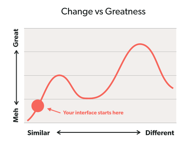
You have to apply those principles carefully because you can have too much of a good thing.
For example, if you “reduce change to the smallest units possible,” you can end up backing yourself into a corner.
The Principle of the Local Maximum (named by Joshua Porter) observes that you can make your current interface better with testing and optimization, but you can’t make the best possible interface, because it’s too different from the current one. (Computer science geeks call this the hill-climbing problem.)
You can iterate on a horse and carriage as much as you want, but you can’t A/B test your way from a horse and carriage to an airplane. Your carriage can only get so good.
So, if radical change is the only way to radically improve, how do you do it without alienating your users? Nobody wants to be responsible for the next Windows 8 fiasco.
Part of the answer can also be found in the hill-climbing problem. First, in your search for solutions, don’t just search nearby. Get out and explore the problem space. Leave your comfort zone, test out new ideas, and learn what works.
When you’ve found a radically great new approach, don’t just spring it on your users without warning. Instead, gently persuade them:
This may be harder than just launching a new product and letting users catch up, but it’s a better path. Remember: We’re making tools for people, and tools are useless if people don’t want to use them.
Further reading:
Looking to make a change? Imarc is ready to help. Let’s talk!